eBook Conversion

eBook conversion for Kindle and ePub readers

Images as chapter headings (Kindle)

If you really don’t like the Kindle’s default chapter styles, then a workable alternative is to use an image instead. Of course, this means creating a different image for every chapter, which is time-consuming if your book is long, but it will look really nice if it’s done well. You could maybe ask the person who’s designing your cover for advice (or get him or her to do these graphics for you as well).

Instructions

Your image should be a GIF and, as discussed in the section on section break graphics, you have to enter the size of the graphic to stop the Kindle resizing it.

The CSS you need is the same as what you’ve been using for text, because graphics in this case are treated in the same way.

h1{ text-align:center; page-break-before: always; margin-bottom: 2em;}

Obviously, if you want your graphic to be left- or right-aligned, change the text-align value accordingly.

Now, putting the image in is not difficult at all; assuming your chapter headings are wrapped in <h1> … </h1> tags, simply adding the HTML code to insert an image between the tags will work. The only problem is that your conversion program has no information on which to build a table of contents.

This is not too difficult to fix; however, I’ve only been able to get this working with Calibre and not with MobiPocket Creator.

Here’s the HTML you’ll need:

<h1 title="Chapter 1"><img src="Chapter1.gif" height="221px" width="250px" alt="Chapter 1" ></h1>

The text you put in the quotes after h1 title is what will appear in the table of contents. Change the height and width values to match the size of your image.

You should also add an alt=”” tag – this is alternate text for an image. When someone is using text-to-speech, an eBook should speak this text when it encounters an image. Unfortunately the Kindle ignores this (poor show, Amazon), but you should still include it – ePub files will not validate unless images have alt tags. (Hopefully Amazon will fix this oversight in a firmware update.)

We now need to tell this to Calibre. The instructions for converting to Calibre are here; in the Table of Contents pane in the Convert dialog, press the magic wand button by the Level 1 TOC field. Enter the following values;

  • Under ‘Match HTML tags …’, enter h1
  • Under ‘Having the attribute’ enter title. Press OK

Bear in mind that, in this case, the output of Calibre’s built-in reader will not be the same as the output in Kindle Previewer or the Kindle.

A sample layout

Kindle file: imageheading.mobi
Source HTML file and images: imageheading.zip

In my prospective Freemasonry-themed conspiracy thriller, I’ve used some Masonic compasses as chapter headings. In the Kindle file, these chapters output as ‘Chapter 1’ and ‘Chapter 2’ in the table of contents. The images are about 17KB each.
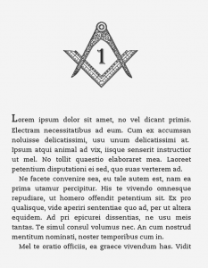
Sample chapter with image chapter heading (click to enlarge)

Styles & Formatting and document conversion

I can’t repeat how much of a timesaver – and good practice – it is to use styles in your word processor document. Not only does it give consistent formatting throughout but it’s also a real time-saver and it makes conversion a whole lot easier.

In both MS Word and Open Office/Libre Office, you do this via the Styles and Formatting pane (go to Format > Styles and Formatting). If you are unfamiliar with this function, go to this site for an explanation.

For a lot of novels, you probably only need three styles – one for the chapter headings, one for the body text (preferably with an indent) and one for the first paragraph of a chapter (without an indent). If you use spaced paragraphs with no indents, then you might only need two.

Even on more technical publications I’ve worked on, I’ve often never needed more than eight or nine – mainly more heading levels and styles for numbered lists, bulleted lists and captions.

A typical layout

basicstyles.doc

This Word 2003 file will open without problems in Word and Open/Libre Office. Once open, display the Styles and Formatting dialog – in Word, select ‘Formatting in Use’ from the ‘Show’ drop-down box in the Styles and Formatting pane; in Open/Libre Office, select ‘Applied Styles’ from the drop-down box at the bottom of the Styles and Formatting box.

This sample document uses the following styles:

  • Normal – normal (indented) paragraph text
  • First – same as normal, but without an indent, for the first paragraph after a heading, indent or list
  • Heading 1 – chapter heading
  • Heading 2 – second-level heading
  • Heading 3 – third-level heading
  • Bulleted
  • Numbered
  • Indent – an indented paragraph for quotes

To be honest, that’s probably all the styles you’ll need, unless you need one for photo captions or another level of headings. Remember, the Kindle isn’t capable of displaying much more (see CSS paragraph styles).

Also, press the Show Hide ¶ button and you’ll notice there is no manual formatting at all – there are no page breaks, tab stops or double paragraph marks and all the spaces are single ones (see this page for common formatting problems).

It may be easier to paste your document into this one and apply these styles, rather than to do it yourself from scratch. However, you need to be careful, because simply pasting text, selecting Select All and applying the style can make your bold and italic formatting disappear. Try the following:

  • Delete the dummy text. Go to Edit > Select all and click on the style that will be most abundant in the document (i.e. ‘normal’). If another style appears in the list, delete it by hovering over the style, going to the drop-down list and selecting delete
  • Go to Edit > Paste Special and select ‘formatted text’ from the list. Press OK
  • You’ll then need to go through the document and apply styles for headings and first paragraphs. Rather than selecting the whole paragraph and applying the style, put the cursor within the paragraph and apply it; this should keep any bold or italics in the copy

Converting word processor files to HTML

cKeditor

If the formatting in your book is simple, then I’d recommend cKeditor, as I outlined in this post. It produces very clean, easy-to-understand HTML that doesn’t need tidying up. It has a couple of downsides:

  1. Custom paragraph styles – such as indented quotes and first paragraphs – are not exported; they have to be restored manually in the HTML code. Therefore if your book is highly formatted, it’s probably not the best choice
  2. It doesn’t save internal links (although it does honour footnotes)

In this case, you’re better off doing the conversion in Open/Libre Office.

Word processors

Although doing your composition in MS Word is fine, its HTML export – at least on Word 2003, which many people (including me) are still using – is awful.

Fortunately, the HTML export from Open/Libre Office is fairly good, if you’ve been strict with applying the styles. So, even if you don’t want to write using this program, you can use it to open your Word file when you’ve finished it and do the HTML export. Here’s a step-by step guide on the basis of this sample file:

  1. In Word, check for unwanted styles by selecting ‘available formatting’ in the Styles and Formatting pane. To get rid of any, select the drop-down list of the style and select ‘Select All’ in the list. Then click on the style you want and the unwanted one should disappear
  2. In Word, ensure all the text has the same language – select all the text and go to Tools > Language > Select Language and pick the preferred one from the list. Sometimes if you don’t do that, the converter will apply language tags to every paragraph
  3. Save and close your document, then open it in Open/Libre Office. If the program prompts you to save in other format, select ‘keep current format’; it doesn’t make much difference to the conversion process
  4. In Open/Libre Office, text with the style ‘normal’ in Word needs to be ‘text body’. You can do this using Find and Replace – open the dialog box, press the More Styles button and select Styles. Replace ‘normal’ with ‘text body’
  5. To save the document, go to File > Save As > HTML. Close the document

Tidying things up

At the top of the page, delete every line starting with <META … > h1{ text-align:center; page-break-before: always; text-decoration: underline; text-decoration: bold; margin-bottom: 2em;} h2{ text-align:left; text-decoration: bold; margin-top: 1em; margin-bottom:0em;} h3{ text-align:left; font-style: italic; margin-top: 1em; margin-bottom:0em;} p.first {text-indent: 0;} p {text-indent: 1em; margin-top: 0; margin-bottom: 0;} p.indented {text-indent:0; margin-left: 2em; margin-right: 0em;}

You now need to do some Find and Replacing. Some complicated tags have been generated, but they’re all consistent and can be fixed in five minutes or so. Refer back to your original Word or Open/Libre Office file to match up what the styles are.

Below is a list of the tags I got in my output, but they may differ slightly depending on your configuration. But it should explain the idea. Remember the tags always come before a paragraph.

Remember, in Notepad++ if you highlight some text then press Find (Ctrl-F), the text will appear automatically in the Find box.

You can keep checking how everything’s looking in the browser in Notepad++ by going to Run > Launch in … (and selecting which browser you’re using).

Type of paragraph Tag outputted by software Replace with
Normal (indented) paragraph <P CLASS=”western”> <p>
Paragraph without indent <P STYLE=”text-indent: 0cm; margin-bottom: 0cm”> <p class=”first”>
Chapter heading <H1 CLASS=”western” STYLE=”margin-top: 0cm”> or
<H1
CLASS=”western”>
<h1>
Second-level heading <H2 CLASS=”western”> <h2>
Third-level heading <H3 CLASS=”western”> <h3>
Indented text <P STYLE=”margin-left: 1cm; text-indent: 0cm; margin-top:
0.21cm”>
<p class=”indented”>

Fancy typography

Section breaks

By which I mean those fancy ornamental graphics that are used to start a new section within a chapter. There seems little agreement as to what they’re actually called; I have heard them described as dinkus, space break symbols, paragraph dividers, fleurons and glyphs. But when you see one, you’ll know what I mean.

Where to find them

Although I’m an editor, I’ve never edited fiction and assumed these things would be easy to find. The odd thing is that they’re not – the only abundant source seems to be photo libraries, who obviously charge for them.

There are free fonts available, which contain these graphics as characters, but these are of no use as typefaces on a Kindle (unless you convert them into graphics using the method described further down).

If you do find some suitable graphics on the web, bear in mind that you may not have permission to use them, unless they’re available under a Creative Commons license or similar, where you can use them as long as you credit the originator. (If you know of a free source of these images, please leave a comment.)

One solution may be to explore some of the Wingdings- or Webdings-style characters that come with Microsoft Office, for example. According to Microsoft’s terms and conditions, they’re cleared for use in publications. In Windows, you can browse through them using the Character Map, which is available in Accessories via the Start button, increase their size and then save the page as a GIF (the method is the same as I described for tables). In a photo editor, you can then cut them out to the required size.

Below are some graphics that I’ve converted from the Wingdings 1 and Wingdings 2 typefaces in Windows.

fleuron 1

fleuron 2

fleuron 3

If your book has a particular theme, you could of course use an appropriate glyph:

Inserting the graphics

Not as easy as you might think. I won’t bore you with the details – simply copy the code.

CSS

In the CSS, between the <style></style> tags, copy and paste this line:

p.sectionbreak {text-indent:0; margin-top:0.5em; margin-bottom:0.5em; text-align:center;}

You can adjust the values for margin-top and margin-bottom as you wish, to change the spacing before and after the graphic.

HTML

In the HTML, insert this line wherever you want the graphic to appear, changing the filename as appropriate (remember in HTML that filenames are case sensitive).

<p class="sectionbreak"><img src="image.gif" height="39px" width="100px" alt="section break"/></p>

Note that you must also include the width and height of the graphic in pixels, otherwise the Kindle will resize them upwards. If you’ve forgotten what size you cropped them to, these values are usually available in the information pane of the window; if not, right-click on the graphic icon and select Properties, where you’ll find the dimensions. For a section break image with a wide aspect ratio, around 100 pixels seems to work okay.

Bear in mind that, unless you define a specific location, graphics must be in the same folder as your HTML file.

If you’re not bothered about having graphics, you could use three asterisks instead. In this case, the HTML would be something like:

<p class="sectionbreak"><strong><big>*&nbsp;&nbsp;*&nbsp;&nbsp;*</big></strong></p>

Joel Friedlander at The Book Designer has written a useful article on this subject.

Drop capitals

Drop capitals (aka drop caps) look very nice on the opening paragraphs of chapters in books. Unfortunately the Kindle doesn’t really support them. It doesn’t support text wrapping around images either, so you can’t cheat by using pictures of capital letters.

The best you can do is to have first letter bigger and poking out above the text.

Option 1

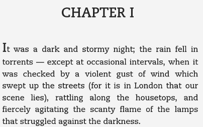
The first option is to make it big and bold in the code by using the <strong> and <big> tags. It’s a bit inelegant in terms of markup. The paragraph has <p class=”first”> because the book has indented paragraphs and we need to have no indent in the first paragraph (see this page).

<p class="first"><strong><big><big><big>I</big></big></big></strong>t was a dark and stormy night; the rain fell in torrents — except at occasional intervals, when it was checked by a violent gust of wind which swept up the streets (for it is in London that our scene lies), rattling along the housetops, and fiercely agitating the scanty flame of the lamps that struggled against the darkness.</p>

Here’s the result:

Drop capital using enlarged text

(Thanks to Natasha Fondren for this tip.)

Option 2

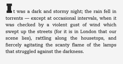
If you’re very patient, you could make graphics of all your drop capitals and insert those. The advantage is that you can use any typeface you want; the disadvantage is that they won’t resize with the text. The example below uses an image that’s 44 pixels high and 36 pixels wide (you have to add this in case the Kindle tries to resize it). Here’s the markup:

<p class="first"><img src="Idropcap.gif" height="44px" width="36px">t was a dark and stormy night; the rain fell in torrents — except at occasional intervals, when it was checked by a violent gust of wind which swept up the streets (for it is in London that our scene lies), rattling along the housetops, and fiercely agitating the scanty flame of the lamps that struggled against the darkness.</p>

Here’s the result:

Drop capital using an image

Supported characters

In the Kindle Publishing Guidelines [PDF], there is a list of all the characters supported by the Kindle.

Tables

The good news is that the Kindle format supports tables. The bad news is it only supports them in the most rudimentary way.

Some things to bear in mind about tables on a Kindle:

1. There is nothing you can do to stop a table breaking across a page. Whether it does or not will depend on how big it is and  on individual users’ font settings
2. The fairly narrow width of the screen means you can only really include simple tables, with a few columns
3. Only use tables to display tabular data. Do not use them as a formatting tool
4. Table options are pretty much non-existent. You can change the alignment in the cells (left, right or centre) and turn the grid lines on and off. The headings will be bold. That’s about it.

How to add a table

As I advised in this post it’s highly recommended that you separate tables and images from your main document.

Copy your table from MS Word and convert it to HTML using cKEditor, as I have outlined already. Copy the source code into a new Notepad++ file.

In Notepad++, use Find & Replace to get rid of all <p> and </p> tags. Then delete everything before the <tbody> tag.

Paste the code <table border=”1″> before the <tbody> tag if you want gridlines or <table border=”0″> if you don’t. Then delete everything after the </table> tag at the end. You can then paste the completed code in your final document where you want it to appear.

Here is a sample HTML file containing a simple table:

Sample table.htm

Using graphics as tables

If your tables are fairly large of complex, another option is to include them as images. You can do this in portrait format, to the width of the page, or in landscape format, where you can use the full height of the screen (although the user must of course turn the reader sideways.

The maximum size, according to Amazon, for an image is 500 pixels (width) x 600 pixels (height). This, however does not fill the whole screen – apparently only the cover is allowed to do that.The best image format to use for tables is probably GIF, whose compression will result in clearer text than something like JPEG or PNG.

Amazon’s formatting guidelines state that a letter ‘a’ should be no smaller than six pixels. I don’t know how to test for this rule, but please think of your readers; some of them may have worse eyesight than you and others may be reading your book on a smartphone. In Kindle Previewer go to Devices in the main menu and see what it looks like on different reading devices.. You can always split a table across two images.

Generating table graphics

There are many ways to do this. The most obvious would be PowerPoint, which lets you save individual slides as GIFs. However, for some reason, GIFs exported from PowerPoint look awful. I’ve had much better results using the same technique using Impress in Open Office or Libre Office. You’ll need to adjust the page size – in Format > Page, setting the page width to 13.23cm gives you 500 pixels width when you export a GIF using File > Export. Deselect the Save Transparency option in the subsequent dialog box.

Converting your text to HTML

Now, here comes the most difficult bit. At this point, you’ll have fixed the layout and typography and you’ll have fixed the structure of your document in your word processor (or decided you’ll just edit the code).

Here are some options.

Read the rest of this entry »

An introduction to HTML and CSS

I’ll admit it: HTML can be scary. Somewhere in your browser menu is a command called View Source or View Page Source – if you select that, you get a load of indecipherable code that looks very intimidating.

However, at the level of a file for an eBook, it’s really isn’t so complicated. HTML is a plain text format – you can write and edit any webpage using Notepad or TextEdit. The basic idea is to surround every element with a container, which take the form of <> and </>.

For instance to make a sentence bold, you would use the <strong> tag:

<strong>This text is entirely bold.</strong>

Read the rest of this entry »

Fixing common errors in your copy

As an editor, here are the most common formatting and typographical errors I have to fix.

Make a copy of your original book before doing any of this, just in case something goes wrong.

I’m assuming here that you’re using MS Word, because most people are. However, the same principles apply in other word processors such as Open Office and iWork – you’ll just have to look up the appropriate Find & Replace symbols and substitute them accordingly. (Note that Google Docs lacks advanced find and replace functions; you may want to download Open Office for these tasks.)

Where I write things like [space], hit the space bar; I’m assuming you’re not going to type in the text verbatim (just checking).

Read the rest of this entry »

© Paul Brookes, 2015. Powered by Wordpress.