Section breaks
By which I mean those fancy ornamental graphics that are used to start a new section within a chapter. There seems little agreement as to what they’re actually called; I have heard them described as dinkus, space break symbols, paragraph dividers, fleurons and glyphs. But when you see one, you’ll know what I mean.
Where to find them
Although I’m an editor, I’ve never edited fiction and assumed these things would be easy to find. The odd thing is that they’re not – the only abundant source seems to be photo libraries, who obviously charge for them.
There are free fonts available, which contain these graphics as characters, but these are of no use as typefaces on a Kindle (unless you convert them into graphics using the method described further down).
If you do find some suitable graphics on the web, bear in mind that you may not have permission to use them, unless they’re available under a Creative Commons license or similar, where you can use them as long as you credit the originator. (If you know of a free source of these images, please leave a comment.)
One solution may be to explore some of the Wingdings- or Webdings-style characters that come with Microsoft Office, for example. According to Microsoft’s terms and conditions, they’re cleared for use in publications. In Windows, you can browse through them using the Character Map, which is available in Accessories via the Start button, increase their size and then save the page as a GIF (the method is the same as I described for tables). In a photo editor, you can then cut them out to the required size.
Below are some graphics that I’ve converted from the Wingdings 1 and Wingdings 2 typefaces in Windows.


If your book has a particular theme, you could of course use an appropriate glyph:
Inserting the graphics
Not as easy as you might think. I won’t bore you with the details – simply copy the code.
CSS
In the CSS, between the <style></style> tags, copy and paste this line:
p.sectionbreak {text-indent:0; margin-top:0.5em; margin-bottom:0.5em; text-align:center;}
You can adjust the values for margin-top and margin-bottom as you wish, to change the spacing before and after the graphic.
HTML
In the HTML, insert this line wherever you want the graphic to appear, changing the filename as appropriate (remember in HTML that filenames are case sensitive).
<p class="sectionbreak"><img src="image.gif" height="39px" width="100px" alt="section break"/></p>
Note that you must also include the width and height of the graphic in pixels, otherwise the Kindle will resize them upwards. If you’ve forgotten what size you cropped them to, these values are usually available in the information pane of the window; if not, right-click on the graphic icon and select Properties, where you’ll find the dimensions. For a section break image with a wide aspect ratio, around 100 pixels seems to work okay.
Bear in mind that, unless you define a specific location, graphics must be in the same folder as your HTML file.
If you’re not bothered about having graphics, you could use three asterisks instead. In this case, the HTML would be something like:
<p class="sectionbreak"><strong><big>* * *</big></strong></p>
Joel Friedlander at The Book Designer has written a useful article on this subject.
Drop capitals
Drop capitals (aka drop caps) look very nice on the opening paragraphs of chapters in books. Unfortunately the Kindle doesn’t really support them. It doesn’t support text wrapping around images either, so you can’t cheat by using pictures of capital letters.
The best you can do is to have first letter bigger and poking out above the text.
Option 1
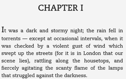
The first option is to make it big and bold in the code by using the <strong> and <big> tags. It’s a bit inelegant in terms of markup. The paragraph has <p class=”first”> because the book has indented paragraphs and we need to have no indent in the first paragraph (see this page).
<p class="first"><strong><big><big><big>I</big></big></big></strong>t was a dark and stormy night; the rain fell in torrents — except at occasional intervals, when it was checked by a violent gust of wind which swept up the streets (for it is in London that our scene lies), rattling along the housetops, and fiercely agitating the scanty flame of the lamps that struggled against the darkness.</p>
Here’s the result:
(Thanks to Natasha Fondren for this tip.)
Option 2
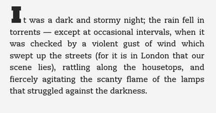
If you’re very patient, you could make graphics of all your drop capitals and insert those. The advantage is that you can use any typeface you want; the disadvantage is that they won’t resize with the text. The example below uses an image that’s 44 pixels high and 36 pixels wide (you have to add this in case the Kindle tries to resize it). Here’s the markup:
<p class="first"><img src="Idropcap.gif" height="44px" width="36px">t was a dark and stormy night; the rain fell in torrents — except at occasional intervals, when it was checked by a violent gust of wind which swept up the streets (for it is in London that our scene lies), rattling along the housetops, and fiercely agitating the scanty flame of the lamps that struggled against the darkness.</p>
Here’s the result:
Supported characters
In the Kindle Publishing Guidelines [PDF], there is a list of all the characters supported by the Kindle.


Howard Pendergraft
on Jan 1st, 2012
@ 4:23 pm:
Thanks a bunch for sharing this with all of us you actually recognize what you’re speaking about! Bookmarked. Please additionally talk over with my site =). We could have a hyperlink exchange agreement among us!