eBook Conversion

eBook conversion for Kindle and ePub readers

Images as chapter headings (Kindle)

If you really don’t like the Kindle’s default chapter styles, then a workable alternative is to use an image instead. Of course, this means creating a different image for every chapter, which is time-consuming if your book is long, but it will look really nice if it’s done well. You could maybe ask the person who’s designing your cover for advice (or get him or her to do these graphics for you as well).

Instructions

Your image should be a GIF and, as discussed in the section on section break graphics, you have to enter the size of the graphic to stop the Kindle resizing it.

The CSS you need is the same as what you’ve been using for text, because graphics in this case are treated in the same way.

h1{ text-align:center; page-break-before: always; margin-bottom: 2em;}

Obviously, if you want your graphic to be left- or right-aligned, change the text-align value accordingly.

Now, putting the image in is not difficult at all; assuming your chapter headings are wrapped in <h1> … </h1> tags, simply adding the HTML code to insert an image between the tags will work. The only problem is that your conversion program has no information on which to build a table of contents.

This is not too difficult to fix; however, I’ve only been able to get this working with Calibre and not with MobiPocket Creator.

Here’s the HTML you’ll need:

<h1 title="Chapter 1"><img src="Chapter1.gif" height="221px" width="250px" alt="Chapter 1" ></h1>

The text you put in the quotes after h1 title is what will appear in the table of contents. Change the height and width values to match the size of your image.

You should also add an alt=”” tag – this is alternate text for an image. When someone is using text-to-speech, an eBook should speak this text when it encounters an image. Unfortunately the Kindle ignores this (poor show, Amazon), but you should still include it – ePub files will not validate unless images have alt tags. (Hopefully Amazon will fix this oversight in a firmware update.)

We now need to tell this to Calibre. The instructions for converting to Calibre are here; in the Table of Contents pane in the Convert dialog, press the magic wand button by the Level 1 TOC field. Enter the following values;

  • Under ‘Match HTML tags …’, enter h1
  • Under ‘Having the attribute’ enter title. Press OK

Bear in mind that, in this case, the output of Calibre’s built-in reader will not be the same as the output in Kindle Previewer or the Kindle.

A sample layout

Kindle file: imageheading.mobi
Source HTML file and images: imageheading.zip

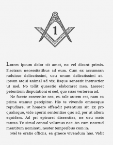
In my prospective Freemasonry-themed conspiracy thriller, I’ve used some Masonic compasses as chapter headings. In the Kindle file, these chapters output as ‘Chapter 1’ and ‘Chapter 2’ in the table of contents. The images are about 17KB each.

Sample chapter with image chapter heading (click to enlarge)

Styles & Formatting and document conversion

I can’t repeat how much of a timesaver – and good practice – it is to use styles in your word processor document. Not only does it give consistent formatting throughout but it’s also a real time-saver and it makes conversion a whole lot easier.

In both MS Word and Open Office/Libre Office, you do this via the Styles and Formatting pane (go to Format > Styles and Formatting). If you are unfamiliar with this function, go to this site for an explanation.

For a lot of novels, you probably only need three styles – one for the chapter headings, one for the body text (preferably with an indent) and one for the first paragraph of a chapter (without an indent). If you use spaced paragraphs with no indents, then you might only need two.

Even on more technical publications I’ve worked on, I’ve often never needed more than eight or nine – mainly more heading levels and styles for numbered lists, bulleted lists and captions.

A typical layout

basicstyles.doc

This Word 2003 file will open without problems in Word and Open/Libre Office. Once open, display the Styles and Formatting dialog – in Word, select ‘Formatting in Use’ from the ‘Show’ drop-down box in the Styles and Formatting pane; in Open/Libre Office, select ‘Applied Styles’ from the drop-down box at the bottom of the Styles and Formatting box.

This sample document uses the following styles:

  • Normal – normal (indented) paragraph text
  • First – same as normal, but without an indent, for the first paragraph after a heading, indent or list
  • Heading 1 – chapter heading
  • Heading 2 – second-level heading
  • Heading 3 – third-level heading
  • Bulleted
  • Numbered
  • Indent – an indented paragraph for quotes

To be honest, that’s probably all the styles you’ll need, unless you need one for photo captions or another level of headings. Remember, the Kindle isn’t capable of displaying much more (see CSS paragraph styles).

Also, press the Show Hide ¶ button and you’ll notice there is no manual formatting at all – there are no page breaks, tab stops or double paragraph marks and all the spaces are single ones (see this page for common formatting problems).

It may be easier to paste your document into this one and apply these styles, rather than to do it yourself from scratch. However, you need to be careful, because simply pasting text, selecting Select All and applying the style can make your bold and italic formatting disappear. Try the following:

  • Delete the dummy text. Go to Edit > Select all and click on the style that will be most abundant in the document (i.e. ‘normal’). If another style appears in the list, delete it by hovering over the style, going to the drop-down list and selecting delete
  • Go to Edit > Paste Special and select ‘formatted text’ from the list. Press OK
  • You’ll then need to go through the document and apply styles for headings and first paragraphs. Rather than selecting the whole paragraph and applying the style, put the cursor within the paragraph and apply it; this should keep any bold or italics in the copy

Converting word processor files to HTML

cKeditor

If the formatting in your book is simple, then I’d recommend cKeditor, as I outlined in this post. It produces very clean, easy-to-understand HTML that doesn’t need tidying up. It has a couple of downsides:

  1. Custom paragraph styles – such as indented quotes and first paragraphs – are not exported; they have to be restored manually in the HTML code. Therefore if your book is highly formatted, it’s probably not the best choice
  2. It doesn’t save internal links (although it does honour footnotes)

In this case, you’re better off doing the conversion in Open/Libre Office.

Word processors

Although doing your composition in MS Word is fine, its HTML export – at least on Word 2003, which many people (including me) are still using – is awful.

Fortunately, the HTML export from Open/Libre Office is fairly good, if you’ve been strict with applying the styles. So, even if you don’t want to write using this program, you can use it to open your Word file when you’ve finished it and do the HTML export. Here’s a step-by step guide on the basis of this sample file:

  1. In Word, check for unwanted styles by selecting ‘available formatting’ in the Styles and Formatting pane. To get rid of any, select the drop-down list of the style and select ‘Select All’ in the list. Then click on the style you want and the unwanted one should disappear
  2. In Word, ensure all the text has the same language – select all the text and go to Tools > Language > Select Language and pick the preferred one from the list. Sometimes if you don’t do that, the converter will apply language tags to every paragraph
  3. Save and close your document, then open it in Open/Libre Office. If the program prompts you to save in other format, select ‘keep current format’; it doesn’t make much difference to the conversion process
  4. In Open/Libre Office, text with the style ‘normal’ in Word needs to be ‘text body’. You can do this using Find and Replace – open the dialog box, press the More Styles button and select Styles. Replace ‘normal’ with ‘text body’
  5. To save the document, go to File > Save As > HTML. Close the document

Tidying things up

At the top of the page, delete every line starting with <META … > h1{ text-align:center; page-break-before: always; text-decoration: underline; text-decoration: bold; margin-bottom: 2em;} h2{ text-align:left; text-decoration: bold; margin-top: 1em; margin-bottom:0em;} h3{ text-align:left; font-style: italic; margin-top: 1em; margin-bottom:0em;} p.first {text-indent: 0;} p {text-indent: 1em; margin-top: 0; margin-bottom: 0;} p.indented {text-indent:0; margin-left: 2em; margin-right: 0em;}

You now need to do some Find and Replacing. Some complicated tags have been generated, but they’re all consistent and can be fixed in five minutes or so. Refer back to your original Word or Open/Libre Office file to match up what the styles are.

Below is a list of the tags I got in my output, but they may differ slightly depending on your configuration. But it should explain the idea. Remember the tags always come before a paragraph.

Remember, in Notepad++ if you highlight some text then press Find (Ctrl-F), the text will appear automatically in the Find box.

You can keep checking how everything’s looking in the browser in Notepad++ by going to Run > Launch in … (and selecting which browser you’re using).

Type of paragraph Tag outputted by software Replace with
Normal (indented) paragraph <P CLASS=”western”> <p>
Paragraph without indent <P STYLE=”text-indent: 0cm; margin-bottom: 0cm”> <p class=”first”>
Chapter heading <H1 CLASS=”western” STYLE=”margin-top: 0cm”> or
<H1
CLASS=”western”>
<h1>
Second-level heading <H2 CLASS=”western”> <h2>
Third-level heading <H3 CLASS=”western”> <h3>
Indented text <P STYLE=”margin-left: 1cm; text-indent: 0cm; margin-top:
0.21cm”>
<p class=”indented”>

CSS paragraph styles

Following on from my post on CSS styles for headings, I’ll now go through some options for paragraph styles. As you’ll now know, paragraphs in HTML are based around the <p> … </p> tags. The instructions here represent a worse-case scenario where your conversion has carried over no formatting at all; if you apply Styles & Formatting to paragraphs in your word processor, then a lot of this may not be necessary (or may just involve changing a few strings with find and replace).

Normal paragraphs

There are really two options for separating paragraphs – indents and spaces. Now, I do not like spaced paragraphs and it’s rare that you’ll see them used in print, for pieces of prose such as novels and biographies. The problem is that it distracts the eye by leading it to the end of the paragraph. Also, especially on a Kindle, it’s a waste of what is a relatively small viewing area, meaning more page turns for the reader.

Indented paragraphs

The important thing about indented paragraphs is that the very first paragraph should not be indented (a common error I’ve seen in eBooks). This is quite easy for a normal webpage (you can use a tag called p+p), but unfortunately it doesn’t work on the Kindle – you have to do it manually.

Here’s the CSS:

p {text-indent: 1em; margin-top: 0; margin-bottom: 0;}

The first instruction tells the eReader to add an indent to the first line of anything within <p>…</p> tags. Of course, we don’t want this to apply to the first line, so we have to change the markup thus:

p.first {text-indent: 0em; margin-top: 0; margin-bottom: 0;}

Unfortunately, if all your first paragraphs are <p> … </p>, then you might have to go to the first paragraph of every chapter and manually change the tag to <p class=”first”>.

However, help may be at hand. In Notepad ++, if you press the ¶ button on the main toolbar, you’ll see these codes.

Text in Notepad++ with invisible formatting displayed

The good news is that they’re searchable and you can use the Search & Replace (Search > Replace) command to find them. Copy all the settings in the example below; \r\n is the shortcut for the hidden characters. As a non-indented paragraph always follows a heading, you can replace </h1>\r\n<p> with </h1>\r\n<p class=”first”>. Repeat this for h2 and h3 headings, by changing the h1 tag.
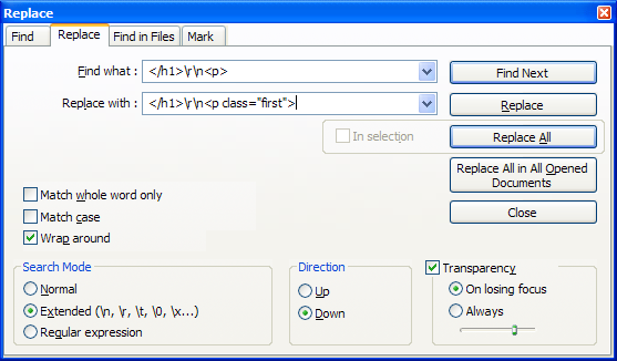
Search/Replace box in Notepad++ with strings for changing first paragraphs below headings

Spaced paragraphs

Spaced paragraphs are more straightforward as you only need the <p> … </p> tags. Here’s the CSS:

p {margin-top: 0.5em; margin-bottom: 0em; text-indent:0;}

Bullet points and numbered lists

There’s no need to change the Kindle’s built-in style for bullet points. The HTML is as follows:

<ul>
<li>Bullet 1</li>
<li>Bullet 2</li>
</ul>

I’ve found, using the conversion methods outlined in this post, that bullet points convert pretty well; numbered lists sometimes not. The code for a numbered list is exactly the same as a bulleted list, except you surround the list items with <ol> … </ol> instead of <ul> … </ul>. If you have a lot of numbered lists, it may be worth converting them to bullets in the source, then just changing these tags in the HTML.

To add spaces either side of lists, use <br> tags on either side of the list.

Changing text alignment

I recommend keeping the Kindle’s default fully justified text alignment, but there are instances where you’ll need to override this. The easiest way to do it is to edit the HTML thus:

<p align="right">The real evils, indeed, of Emma's situation were the power of having rather too much her own way, and a disposition to think a little too well of herself; these were the disadvantages which threatened alloy to her many enjoyments. The danger, however, was at present so unperceived, that they did not by any means rank as misfortunes with her.</p>

For left aligned text use <p align=”left”> and for centred text use <p align=”center”>

Indents

Here’s the CSS for an indent, to use – for example – for a quote.

p.indented {text-indent:0; margin-left: 2em; margin-right: 0em;}
Here's the HTML:


<p class="indented">Sixteen years had Miss Taylor been in Mr. Woodhouse's family, less as a governess than a friend, very fond of both daughters, but particularly of Emma. Between them it was more the intimacy of sisters.</p>

If you want your quotes in italics, then add font-style:italic; to your CSS:

p.indented {text-indent:0; margin-left: 2em; margin-right: 0em; font-style:italic;}

Size of indents

The Kindle has a limit on indents, presumably to stop text disappearing off the edge of the page at very large text sizes. Therefore, I’d recommend setting your paragraph indents to 1em and your quote indents to 2em (which seems to be the maximum). The Kindle ignores any values for the right margin, presumably for the same reason.

Spacing before and after indents

I haven’t had much success doing this consistently. One way around this is to put <br> tags either side of the indented paragraph in the HTML, which forces a space.

Captions

Here’s a suggestion for the CSS for a caption to go under a photo illustration (small and bold essentially):

p.caption {font-size:0.5em; text-indent: 0; font-weight:bold;}

Here’s the HTML

<p class="caption">Caption text here</p>

There is no way to prevent a caption being separated from the image it is under. One workaround may be to add the caption in a photo editor onto the image. I haven’t yet decided whether this is good idea or not – the downside is that the caption text is not searchable and it means the blind and visually impaired won’t know what the caption is.

Fixed width

Wrapping text in the <code> … </code> tags imparts a Courier-style fixed width font. The only instance I’ve used something like this is when including code in a technical publication.

Formatting poetry

Something I’ll admit I’ve no experience of. Ben Crowder has written some tips for formatting poetry for ePub and Kindle formats, which discusses things like line numbers and hanging indents.
Book covers

One of the downsides of Kindles and other eReaders has been the decline in the importance of the cover. No longer can you see what other people are reading; and no longer can you hope to impress girls by pretending you understand Proust.

That’s not to say that there are no upsides – you may be a professor of theoretical physics at MIT who secretly likes reading Danielle Steel. I digress …

Read the rest of this entry »

Tables

The good news is that the Kindle format supports tables. The bad news is it only supports them in the most rudimentary way.

Some things to bear in mind about tables on a Kindle:

1. There is nothing you can do to stop a table breaking across a page. Whether it does or not will depend on how big it is and  on individual users’ font settings
2. The fairly narrow width of the screen means you can only really include simple tables, with a few columns
3. Only use tables to display tabular data. Do not use them as a formatting tool
4. Table options are pretty much non-existent. You can change the alignment in the cells (left, right or centre) and turn the grid lines on and off. The headings will be bold. That’s about it.

How to add a table

As I advised in this post it’s highly recommended that you separate tables and images from your main document.

Copy your table from MS Word and convert it to HTML using cKEditor, as I have outlined already. Copy the source code into a new Notepad++ file.

In Notepad++, use Find & Replace to get rid of all <p> and </p> tags. Then delete everything before the <tbody> tag.

Paste the code <table border=”1″> before the <tbody> tag if you want gridlines or <table border=”0″> if you don’t. Then delete everything after the </table> tag at the end. You can then paste the completed code in your final document where you want it to appear.

Here is a sample HTML file containing a simple table:

Sample table.htm

Using graphics as tables

If your tables are fairly large of complex, another option is to include them as images. You can do this in portrait format, to the width of the page, or in landscape format, where you can use the full height of the screen (although the user must of course turn the reader sideways.

The maximum size, according to Amazon, for an image is 500 pixels (width) x 600 pixels (height). This, however does not fill the whole screen – apparently only the cover is allowed to do that.The best image format to use for tables is probably GIF, whose compression will result in clearer text than something like JPEG or PNG.

Amazon’s formatting guidelines state that a letter ‘a’ should be no smaller than six pixels. I don’t know how to test for this rule, but please think of your readers; some of them may have worse eyesight than you and others may be reading your book on a smartphone. In Kindle Previewer go to Devices in the main menu and see what it looks like on different reading devices.. You can always split a table across two images.

Generating table graphics

There are many ways to do this. The most obvious would be PowerPoint, which lets you save individual slides as GIFs. However, for some reason, GIFs exported from PowerPoint look awful. I’ve had much better results using the same technique using Impress in Open Office or Libre Office. You’ll need to adjust the page size – in Format > Page, setting the page width to 13.23cm gives you 500 pixels width when you export a GIF using File > Export. Deselect the Save Transparency option in the subsequent dialog box.

© Paul Brookes, 2015. Powered by Wordpress.