If you’ve read this article, you’ll know about book structure and if you’ve read this page, you’ll understand the basics of HTML and CSS.
At this point, you can now think of how you want your book to look visually. CSS has a very rigid syntax:
h1 {text-align:center; page-break-before: always;}The code starts with the class it will act upon (in this case, the h1 heading). The list of rules is contained within curly brackets and individual rules are separated with semicolons. If you don’t follow this syntax exactly, your text won’t display properly.
The options listed on this page would all apply to an HTML heading with h1 tags.
<h1>Chapter 1</h1>You may have some more levels of heading (from h2 to h6) and you’ll need to add CSS rules for these.
Alignment
Three options are available – centred, left and right:
h1 {text-align:center;}
h1 {text-align:left;}
h1 {text-align:right;}
Text Decoration
(I know I said underlining should never be used, and I stand by that, but I can let it go in a chapter heading if used tastefully.) The available styles are underline and italic:
h1 {text-decoration:underline;}
h1 {font-style:italic;}
Automatic formatting
This is a very useful feature – this direction will automatically start a heading on a new page, so it always appears at the top. This saves you the trouble of inserting manual page breaks.
h1 {page-break-before: always;}
Size
There is a CSS command called text-size, whereby you can set the relative sizes of headings to one another. However, the Kindle seems to ignore them and use its default sizings. Therefore I would generally recommend not bothering with them and just accepting the defaults.
Spacing
You can set the space below and above a heading, so that sections are clearly distinguished. I find it’s best to set both margin-above and margin-below (even if their values are zero), as some eReaders have a habit of deciding their own spacing if you don’t define it yourself.
h1 {margin-top: 1em; margin-bottom:0em;}
A page divider
By this I mean a page only containing a heading, centred horizontally and vertically. For example, a Part I page that comes before Chapter 1.
h1 {text-align:center; page-break-before: always; page-break-after: always; margin-top:50%;}
My chapter headings are too big!
If you’re chapter headings are much longer than the ‘Chapter 1’, ‘Chapter 2’ kind of headings, they can look quite unwieldy on the page. And there’s no way to change the relative sizes of text on a Kindle.
Now, I wouldn’t recommend this as good practice for writing webpages, but on a Kindle, what you can do is start your headings with <h2> … </h2> or <h3> … </h3> tags.
This can be easily fixed with Find & Replace, but remember to start with the lowest level headings first and work your way up, or you’ll get into trouble. So, if you’re using <h1> to <h3>, for example, change <h3> to <h6>, <h2> to <h5>, then <h1> to <h3>.
In addition, you’ll have to modify the table of contents settings as appropriate in Calibre or MobiPocket Creator.
An example
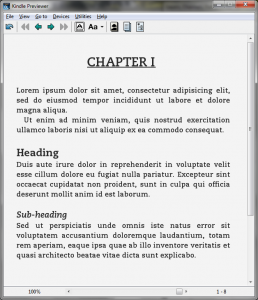
Of course, you can combine all the above options as you wish. Below are some CSS heading rules and the resulting page on the Kindle Previewer.
h1{ text-align:center; page-break-before: always; text-decoration: underline; text-decoration: bold; margin-bottom: 2em;}
h2{ text-align:left; text-decoration: bold; margin-top: 1em; margin-bottom:0em;}
h3{ text-align:left; font-style: italic; margin-top: 1em; margin-bottom:0em;}

Leave a Reply